Adjustments
An adjustment layer changes the tones of everything below it without touching the photograph, so you can change or remove it at any time. Click an adjustment in the Adjustments panel, or choose Layer → New Adjustment Layer. The new layer appears above the layer you selected, and its settings open in Properties.
Every adjustment layer has a mask and an opacity, and can be hidden, grouped or clipped like any layer. Use Reset in a group to put its sliders back, or double-click a slider to reset just that one. You can also type a value into the box beside a slider.
Exposure
Exposure lightens or darkens as though you had changed the exposure, in stops.
- The Step row has − and + buttons that make the picture darker or lighter by one step, and a switch between ½ stop and ⅓ stop steps (the app remembers your choice). A press moves to the next half or third of a stop in that direction, so from +0.37 the next ⅓ step up is +0.67. Each press is one undo step.
- Exposure raises or lowers the picture by up to five stops. The slider is continuous, in steps of 0.01 stop, so you can set any value. The ½ stop and ⅓ stop switch only changes how far the − and + buttons move; it does not make the slider snap.
- Offset shifts the darkest tones.
- Gamma brightens or darkens the midtones without moving black or white.
Zones
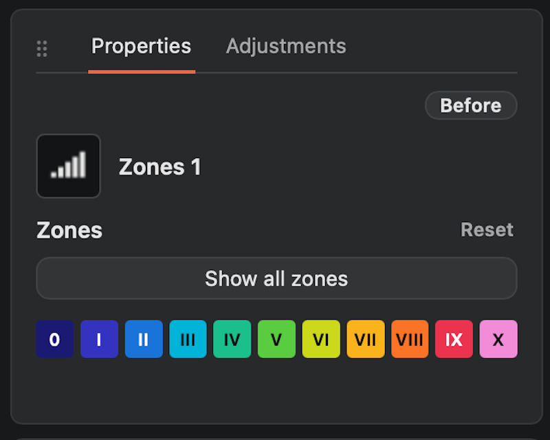
Zones is for working with the zone system. The picture's tones are divided into zones from 0 (black) to X (white), each ten steps of lightness apart, with V as middle grey. The same zone numbers appear in the Info panel and next to the Tone Sampler.
Each slider, I to IX, makes the tones around that zone lighter or darker by up to a zone and a half. A slider reaches about three zones either way, so neighbouring tones move with it and nothing is squeezed flat. Black and white stay where they are. The sliders together make one smooth tone curve, so there are no hard edges or halos. If you push several sliders so hard that some tones would lose their contrast, the layer eases them back together and says so under the buttons.
- Show all zones colours each zone over the picture, so you can see where your tones are. The row of coloured boxes underneath is the key: 0 to X, black to white. A small dot under a box means the layer already changes that zone. Click one to show only that zone, with the rest of the picture plain and a little darker, and click it again to go back to the plain picture.
- Drag on the picture while a zone is picked or the zones are showing: press on the picture and drag up or down. If you picked a zone with the key, that zone gets lighter or darker; otherwise the zone under the pointer does. The slider moves with it. The tone is the one this layer receives, from the layers below it. The colours are hidden while you drag and stay hidden when you let go, so you can judge the real picture; the box you picked stays highlighted, and you can drag again to carry on. Click the highlighted box once to see the zone's colours again, and again to go back to the plain picture. Hold Space to pan instead.
The layer names itself after what it does, for example Zone VII ↓ (darker) or Zones III ↓, VII ↑, and the name follows as you move the sliders. If you rename the layer yourself, your name stays.
To change a zone in only part of the picture, give the layer a mask, or make a selection first, and paint through it. The adjustment is the same everywhere; the mask decides where it shows.
What the number beside a slider means
The small number beside each slider is how many zones it is set to lighten (plus) or darken (minus) the tones around its zone. For example, +0.50 on zone VI lightens the tones around zone VI by half a zone, and −1.00 on zone III darkens the tones around zone III by a whole zone. A zone is ten steps of lightness, so one zone is a large change. The range is −1.5 to +1.5, and 0.00 means the zone is untouched. Double-click a slider to put it back to 0.
The number is the setting you chose, not an exact measurement of the result. Neighbouring sliders overlap, so zone VII at −0.90 does not darken zone VII by exactly 0.9 of a zone, and if the sliders are eased back as described above, the numbers show what you set, not what is applied. Think of each number as the strength and direction of that zone's change.
Paper Grade
Paper Grade adds the contrast of a darkroom paper grade. The scale runs from 0 (soft) through 2 (no change) to 5 (hard), in half steps. It is an approximation of how grades look, not a calibrated simulation of any one paper.
Switch to Split grade to print as in split-grade printing: a Soft grade controls the highlights and a Hard grade controls the shadows. Balance moves the point where one takes over from the other.
Toning
Toning adds colour to a black and white photograph, as chemical toners such as selenium or sepia do. It colours the finished picture, so you can place the layer anywhere in the stack, and each pixel keeps its brightness: only the tones in between take colour, and pure black and pure white stay neutral.
Choose a tone from Preset: Platinum, Selenium, Sepia, Gold, Cyanotype, Copper, Cool Silver or FMS (a warm brown, after an old albumen print). These are creative looks, not calibrated chemical simulations. Use Balance to move the colour towards the shadows (left) or the highlights (right): Selenium starts in the shadows and Sepia in the highlights, as the real toners do. Use Strength to weaken or strengthen the tone: it is the same control as the layer's opacity, so the Opacity slider in the Layers panel moves with it. Use the layer's mask to tone only part of the picture. Two Toning layers with different masks give split toning, for example a cool tone in the shadows and a warm one in the highlights.
Split toning
Switch Single tone to Split tone to give the shadows one colour and the highlights another, as when a print is toned in two baths. Pick Selenium / Sepia or Cool / Warm from Preset to start, or choose Custom and use Shadow colour and Highlight colour to choose which of the two the colour field is editing. The colours blend smoothly from the darkest tones to the lightest, and Balance now moves the point where one gives way to the other: move it towards Shadows (left) and the shadow colour reaches further up into the picture, towards Highlights (right) and the highlight colour reaches further down. Strength, the mask and the other controls work as before.
Mix a custom colour
Choose Custom to show the colour field.
- Drag left or right to choose the colour, and up for more strength or down for less.
- With the field selected, press the arrow keys for small changes, or hold Shift for larger steps.
-
The letters under the field show where red, yellow, green, cyan, blue and magenta are.
Save your own presets
Any change to a preset's colour or balance shows Custom. Type a Preset name and click Save. Your preset joins the list and can be used on any Toning layer. To remove one, choose it and click Delete preset; layers that already use the colour keep it.
Exporting a toned picture
A toned picture exports and prints in colour (RGB). To export plain grey, hide the Toning layer first.
Brightness/Contrast
Brightness raises or lowers all tones. Contrast increases or reduces the separation of dark and light tones.
Levels
Levels sets the darkest and lightest points of the photograph and the balance of the midtones.
- Drag the black and white triangles under the histogram, or use the Black and White sliders, to choose which tones become pure black and pure white.
- Drag the grey triangle, or use Gamma, to brighten or darken the middle tones.
- Hold Alt while dragging the black or white triangle to see which parts of the picture would clip.
Curves
Curves reshapes the tones precisely.
- Click the curve to add a point and drag a point to move it. Right-click a point to remove it.
- Drag an end point inwards to clip the shadows or highlights.
- The Input and Output boxes show the selected point; type values to place it exactly. The 0–255 | % switch between them chooses whether they show levels or percentages. The app remembers your choice.
- With a point selected, the arrow keys nudge it: left and right move Input, up and down move Output, one step at a time (one level, or 1% in the percent view). Hold Shift for ten steps.
- To choose a point without the mouse, click the curve and press + or - for the next or previous point (they wrap round), or Home and End for the first and last. A click that wobbles a few pixels does not move the point.
- Hold Alt while dragging an end point to see what clips.
- Add 21 points (next to Reset) places 21 evenly spaced points on the curve, 5% apart, without changing its shape. Use it to build a 21-step curve: move each point to set the tone for that step. There is no limit on the number of points, unlike Photoshop's 16.
- Target (in the Curves header) lets you pick tones from the picture. Click it, then press on a part of the picture: a point appears on the curve at that tone. Without letting go, drag up to lighten it or down to darken it. Pressing near an existing point (within about 1.5% of the range) picks that point up instead of adding another. The point you are moving is selected, so Input and Output show its values as you drag. While the pointer moves over the picture, a marker on the curve shows where that tone sits. The tone is what the Curves layer receives, from the layers below it. Each drag is one undo step. Click Target again to switch it off; it also switches off when you choose another tool or layer. Hold Space to pan while it is on.
Sharpen
Sharpen makes edges crisper with an unsharp mask: the picture below it is blurred, and the difference between the original and the blur is added back. Unlike the other adjustments it looks at neighbouring pixels, so it is the layer to use for the final touch of detail.
- Amount is how strongly edges are sharpened, from 0 to 300.
- Radius is how wide the effect spreads from an edge, in pixels of the picture, from 0.3 to 20. A small radius sharpens fine detail; a large one gives a broader, more local contrast.
- Threshold is the size of difference, in grey levels, that is treated as grain and left alone. Raise it to sharpen real edges without making film grain more visible.
It is built to look natural. Small differences fade out smoothly instead of switching on at a hard cut-off, the amount added at any edge is limited so bright halos cannot build up, and the effect fades out near pure black and white so tones do not clip.
The layer has a mask like any other, so you can paint the sharpening away from smooth areas such as sky. Sharpening is calculated in picture pixels, so judge it at 100% zoom. When you are zoomed out the preview is only an approximation, and Properties says so. The exported file and prints are always exact.
Sharpen does nothing inside a group set to Normal with its own adjustment layer. Put it above the group instead.
Grad D&B
Grad D&B (graduated dodge and burn) lightens or darkens the picture from one edge, fading smoothly to nothing. It is the quick way to burn in a sky or hold back a bright foreground, as when a darkroom print is shaded with a hand or a card.
- Choose Grad D&B in the Adjustments panel. The layer starts empty, so nothing changes yet.
- In Properties, choose Dodge to lighten or Burn to darken.
- Click a square: the rows are the edge the effect starts from (Top, Bottom, Left, Right), and the three columns say how far it reaches, a third, a half or two thirds of the way across the picture. The icons show the fade: the solid end is the edge.
- Use Strength to weaken or strengthen it. It is the same control as the layer's opacity, so the Opacity slider in the Layers panel moves with it.
The effect is full strength at the edge and eases out to nothing at the end of its reach. A dodge is one stop lighter at the edge, and a burn one stop darker. The fade is written into the layer's mask, so you can see it in the mask thumbnail, and you can paint it away or soften it with the mask like any other.
- The layer is named after the square you clicked, for example Dodge top ⅓ or Burn left ½, and the name changes if you click a different square. If you rename the layer yourself, your name stays.
- Each click adds a layer. Click a square and the fade goes on a new Grad D&B layer. The one exception is a layer you have just added, which is still empty: the first click fills it. Stack layers to build up, for example, a burned sky and a dodged foreground, or to double the strength of one edge. If you pick the wrong square, press Cmd/Ctrl+Z, which removes the layer and its fade together.
- Shift-click (or Alt-click) a square to replace the fade of the selected Grad D&B layer with a different one, instead of adding a layer.
- The fade follows the picture as you see it, after any turn, flip, straighten and crop. If you change those afterwards, Shift-click the square again to fit the fade to the new picture.
- A locked layer cannot take a fade.
Vignette
Vignette darkens or lightens the corners and edges of the picture in a soft oval, leaving the centre alone.
- Choose Vignette in the Adjustments panel. The layer starts empty, so nothing changes yet.
- In Properties, choose Darken or Lighten.
- Click a Size: Wide starts the effect close to the centre, Medium a little further out, and Tight keeps it to the corners and edges.
- Use Strength to weaken or strengthen it. It is the same as the layer's opacity.
The oval fits the picture as you see it, after any turn, flip, straighten and crop, and the effect is strongest in the corners. The layer is named after your choice, for example Darken wide or Lighten tight, unless you have renamed it yourself. Like Grad D&B it is written into the layer's mask, so you can paint it away or soften it. Each click on a size adds a new Vignette layer, except onto a layer you have just added and not used yet. Shift-click (or Alt-click) a size to replace the selected Vignette layer's vignette instead. If you crop or rotate afterwards, Shift-click the size again to fit the vignette to the new picture.
Before and after
Hold the Before button in Properties to see the picture without the adjustments. It switches off Sharpen and Toning layers as well as the tone adjustments.